Mapping suburbs with jVectorMap
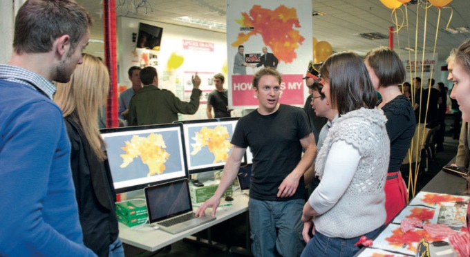
At REA we have a lot of data about the Australian property market. On our last hack day we explored new ways to put it to use. I prepared some map data and examples with jVectorMap to help visualise suburb data.
jVectorMap comes with border data for the countries of the world and the states of the USA and several other countries. We needed to map suburbs in Sydney and Melbourne, so I took some data from the Australian Bureau of Statistics, selected a relevant subset using QGIS, and ran it through jVectorMap’s conversion script to produce files in its JSON format. I ended up making a few changes to the conversion script to get the results I wanted. The process is explained in more detail on GitHub.
It is good for heat maps, but jVectorMap also lets you add interactivity by providing hooks to respond to hover, enter, exit and click events.
It can zoom in and out, but since it works with a single set of vector data, it may not be the best choice for applications where your zoom range is big enough to call for data at several levels of detail. For example, data that’s detailed enough to show individual Australian suburbs looks great at the city level, but doesn’t render so well at the national level.
Several teams put it to use on hack day, with great results.