Log visualization with gnuplot
Often when investigating an issue there is information in logs that isn’t captured well by Prometheus metrics. This includes qualitative information such as stack traces, but the frequency of certain messages may also be of interest and that is what this we will focus on here.
Selecting interesting log messages
A recent issue showed memcached exceptions in the Prometheus metric
serviceapi_memcached_exceptions_total (including the exceptions
IndividualRequestTimeoutException and KetamaFailureAccrualFactory$$anon$1),
but the logs also included messages such as:
2016-04-13_18:09:17.87161 18:09:17.871 [finagle/netty3-9] ERROR SERVICE_API_THRIFT - traceId [2ac36e44bf4c0a96.2ac36e44bf4c0a96<:2ac36e44bf4c0a96] [0 ms] updateByActor -> FAILURE
2016-04-13_18:09:17.87162 java.lang.Exception: Failed adding record to memcached: 'Target(218468078)'
2016-04-13_18:09:17.87162 at com.example.service.record.RecordRepository.com$example$service$record$RecordRepository$$$anonfun$15(RecordRepository.scala:102)
2016-04-13_18:09:17.87163 at com.example.service.record.RecordRepository$lambda$$addToRemoteCache$1.apply(RecordRepository.scala:100)
2016-04-13_18:09:17.87164 at com.example.service.record.RecordRepository$lambda$$addToRemoteCache$1.apply(RecordRepository.scala:100)
which could more easily be tied to a specific code path.
I could see these messages appearing throughout the incident, but I wanted to get a sense of the frequency and at what stages of the incident they appeared.
After retrieving some logs from the relevant instance, I identified a few interesting subsets of log messages:
grep 'MEMCACHED set failed with .*IndividualRequestTimeoutException'
grep 'WARN.*Endpoint is marked dead by failureAccrual'
grep 'Failed adding record to memcached'
Extracting times & generating counts per second
The strptime utility from dateutils can
parse and convert timestamps. By default it discards non-matching portions, so
piping in log lines beginning with timestamps of the form:
2016-04-13_18:09:17...
and specifying the input and output
formats
to be %F_%T and %s%n generated output lines with a Unix timestamp only, in
seconds since the epoch.
The next step in processing was to count how many times each second-resolution
timestamp occurred, using uniq‘s -c (count) option.
The full data preparation process was:
cat logs.txt | grep 'ERROR' | strptime -i '%F_%T' -f '%s%n' | uniq -c > error.dat
cat logs.txt | grep 'MEMCACHED set failed with .*IndividualRequestTimeoutException' | strptime -i '%F_%T' -f '%s%n' | uniq -c > memcached-set-failed.dat
cat logs.txt | grep 'WARN.*Endpoint is marked dead by failureAccrual' | strptime -i '%F_%T' -f '%s%n' | uniq -c > dead-by-failureaccrual.dat
cat logs.txt | grep 'Failed adding record to memcached' | strptime -i '%F_%T' -f '%s%n' | uniq -c > fail-adding.dat
Each of the four generated files was in this format (count, timestamp):
685 1460570400
483 1460570401
953 1460570402
587 1460570403
694 1460570404
...
Plotting with gnuplot
gnuplot is an open source plotting tool, first released 1986. It is a command line program that is useful both for interactive data analysis and scripted presentation of final graphics in many different output formats.
I like to build up a gnuplot script by running a text editor in one window and
sending commands from there into an interactive gnuplot terminal in another
window. If your editor isn’t set up for that (e.g. with
tslime.vim), you can always use cut
and paste or tell gnuplot to load your script from a file
(load 'yourfile.gnuplot').
I began with these gnuplot commands:
set xdata time
set timefmt "%s"
set format x "%H:%M"
set yrange [0:*]
plot 'error.dat' using 2:1 title 'error' with impulses lw 0.1, \
     'memcached-set-failed.dat' using 2:1 title 'memcached-set-failed' with impulses lw 1, \
     'dead-by-failureaccrual.dat' using 2:1 title 'dead-by-failureaccrual' with impulses lw 1, \
     'fail-adding.dat' using 2:1 title 'fail-adding' with impulses lw 2
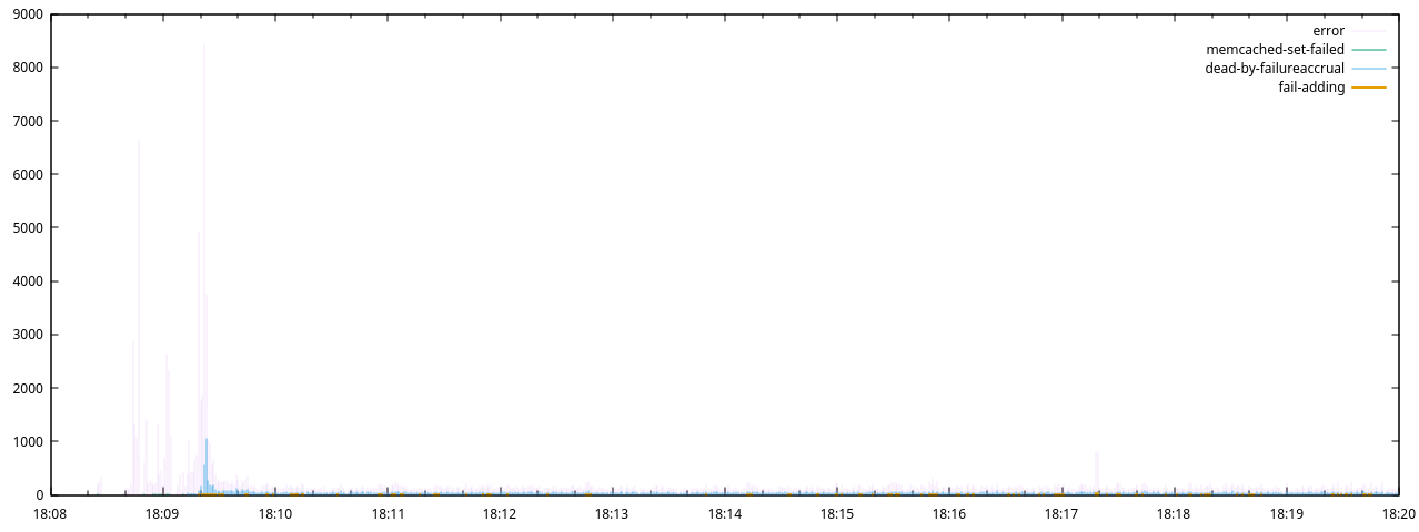
Which generated this plot:
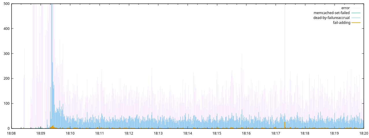
Next I restricted the range of the y-axis and refreshed the plot:
set yrange [0:500]
refresh
And again:
set yrange [0:100]
refresh
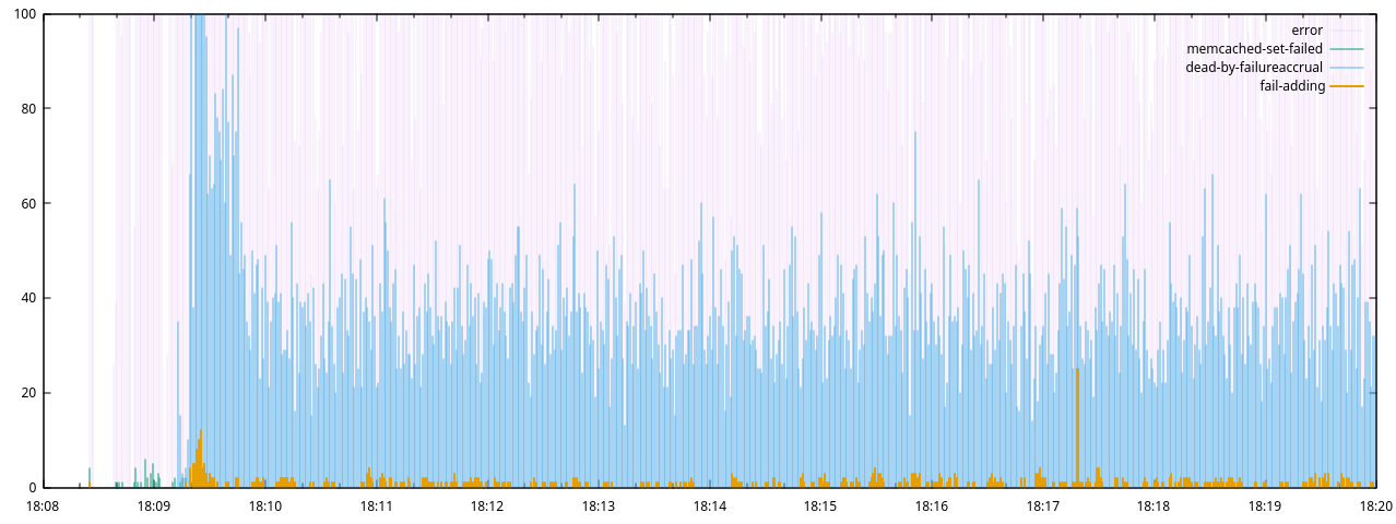
Here it is clear that IndividualRequestTimeoutExceptions were only present
during an initial 30s period, after which Finagle’s Endpoint is marked dead by
failureAccrual warnings began, with a much greater frequency than our own
Failed adding record to memcached messages. This indicated that the
finagle-memcached client’s internal retries were responsible for a large
proportion of the exceptions, and the finally failed incoming requests were
actually much fewer. These error remained stable from 18:10 to 18:20 (despite
the serviceapi_finagle_memcached_client_dead_nodes metric in Prometheus
showing recovery of all dead nodes by 18:10).
In this chart, the x-axis range is set automatically by the range of the input data, and gnuplot’s defaults are used for tick spacing, color selection and legend formatting, although it is possible to control all this and more if required.
Let’s take a closer look at the plot command:
plot 'error.dat' using 2:1 title 'error' with impulses lw 0.1
| part | meaning |
|---|---|
plot |
The gnuplot command |
'error.dat' |
Our data file, with space separated values (by default) |
using 2:1 |
Use columns 2 (time) and 1 (count) for x and y values. Column numbers always start from 1 |
title 'error' |
The title for this series, to be displayed in the legend |
with impulses |
Use the impulses plotting style for this data |
lw 0.1 |
lw is the abbreviated form of linewidth.Many gnuplot options have abbreviations |
When multiple data sets are to be plotted, they should be separated by commas. Note that the different series of data are drawn in the order they are specified in the plot command, so it is important to find an order that does not obscure significant features of the data. I also chose different line widths in order to improve the visibility of certain features.
Plotting style choice
In this example we used the impulses plotting style, which draws a line from
y=0 up to the value of each data point. This is very simple and quite
readable, and it’s what I recommend for plotting frequencies from log data.
The lines style would plot data from the same files, have the benefit of not
drawing over the top of smaller values, and perhaps even look a little nicer,
but it is complicated by interpolation. If there is no data point for a given x
coordinate, it will be interpolated from the values of the points to either
side of it, which means that times for which there was no count observed will
not display as zero. Additional pre-processing could be done to insert zero
values for any missing x coordinate in the data range, but for ad hoc analysis
my preference is to just use impulses.
Another alternative would be to draw a histogram using the boxes plotting
style, but this requires additional logic for assigning data points to
different buckets.
Lower resolution counts
In this example we generated counts per second for the different log messages.
To have wider counts, for example, per minute, we can use dateutil’s dateround
instead of strptime and round the timestamps as we parse them:
cat logs.txt | grep ERROR | dateround -i '%F_%T' -f '%s%n' /15s | uniq -c > errors-per-quarter-minute.dat
cat logs.txt | grep ERROR | dateround -i '%F_%T' -f '%s%n' /1m | uniq -c > errors-per-minute.dat
Further reading
Gnuplot has excellent reference documentation, and it’s easy to find blog posts describing many different tasks, but if you would like a more complete guide in tutorial form, I highly recommend Gnuplot in Action: Understanding data with graphs: